

A few days ago, I received a renewal reminder from Norton informing me that my Norton 360 Deluxe subscription would expire in 20 days. Like most people, I wasn't planning to read the email from top to bottom. I simply wanted to know one thing: how much would it cost to renew?
As my eyes moved down the email, I landed on the pricing section. That's where something immediately felt strange.
The price ₹1,199 was displayed with a strike-through, and directly below it, in a larger and more prominent font, the same price ₹1,199 appeared again. I stopped scrolling and looked at it a second time because I assumed I had read it incorrectly. But after checking again, I realized both numbers were identical.
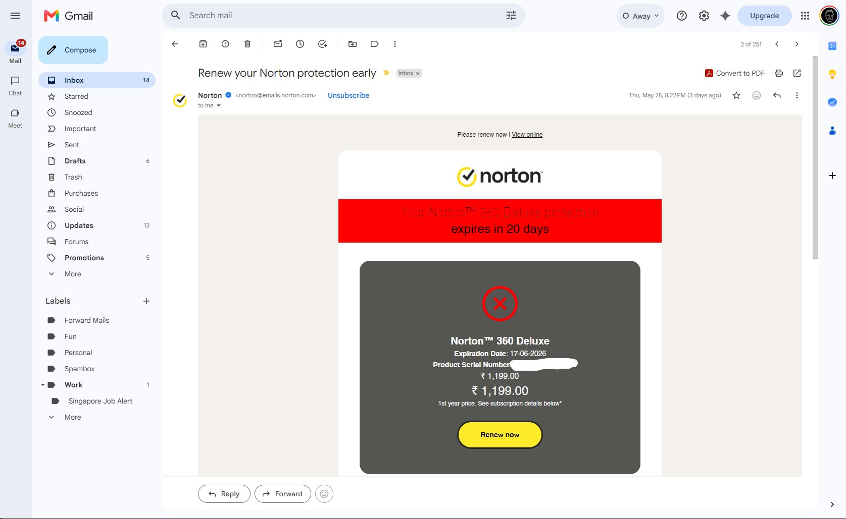
The Norton 360 Deluxe renewal email — ₹1,199 with a strike-through, then ₹1,199 again in a larger font directly below it.
At that moment, I wasn't thinking about cybersecurity or subscription renewals anymore. I was trying to understand the interface itself.
Years of online shopping have taught me a simple visual rule: when a price is crossed out, the number beneath it represents a new, lower price. It is one of the most recognizable patterns in digital commerce. Whether it's Amazon, Flipkart, Myntra, or Swiggy, the strike-through pattern almost always communicates a discount.
Norton used that same visual language — but without delivering the meaning users expect from it.
Instead of communicating a clear price reduction, the design presented the same value twice. The interface triggered a familiar mental model and then failed to fulfill it. Rather than helping me understand the offer, it created a moment of uncertainty.
I eventually noticed the small line beneath the price that read, "1st year price. See subscription details below." While the information was technically available, it carried far less visual weight than the pricing itself. My attention had already been captured by the larger numbers and the prominent renewal button. The explanatory text felt secondary, even though it was arguably more important for understanding the offer.
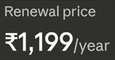
Renewal price detail — easily missed

What a real discount looks like

The actual first-year pricing structure
UX Psychology Analysis
Users spend most of their time using other digital products. Therefore, they expect similar patterns to behave similarly.
The pattern breaks established expectations. As a result, users must spend additional effort interpreting the message.
The largest visual elements in the card are the expiration warning, the ₹1,199 price, and the Renew button. The explanatory text — "1st year price. See subscription details below" — is significantly smaller. As a result, attention is drawn toward action before understanding.
A crossed-out price communicates: "There is a deal here."
When the price remains unchanged, the visual cue becomes misleading. The scent promises information that doesn't exist.
Nielsen Heuristic Evaluation
What I Would Recommend
Ambiguity in pricing isn't neutral — it erodes trust.
Users who have to work to understand what something costs are users who are already questioning whether they should proceed. The interface's job is to remove doubt, not create it.