
While randomly scrolling through the Google app, a popup appeared — an advertisement for a travel app. It suggested using an app called Wanderlog - Trip Planner, highlighting that it was an Editors' Choice winner on the Play Store with over 5 million users.
This intrigued me enough to try out the app.

The Wanderlog dashboard. What I eventually reached — after everything that came before it.
As their ad showed, the app welcomed me by displaying its Play Store achievements. Excited!
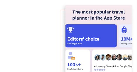
The most popular travel planner in the App Store. Bold entry screen.
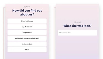
"How did you find out about us?" — before I've even seen the app.
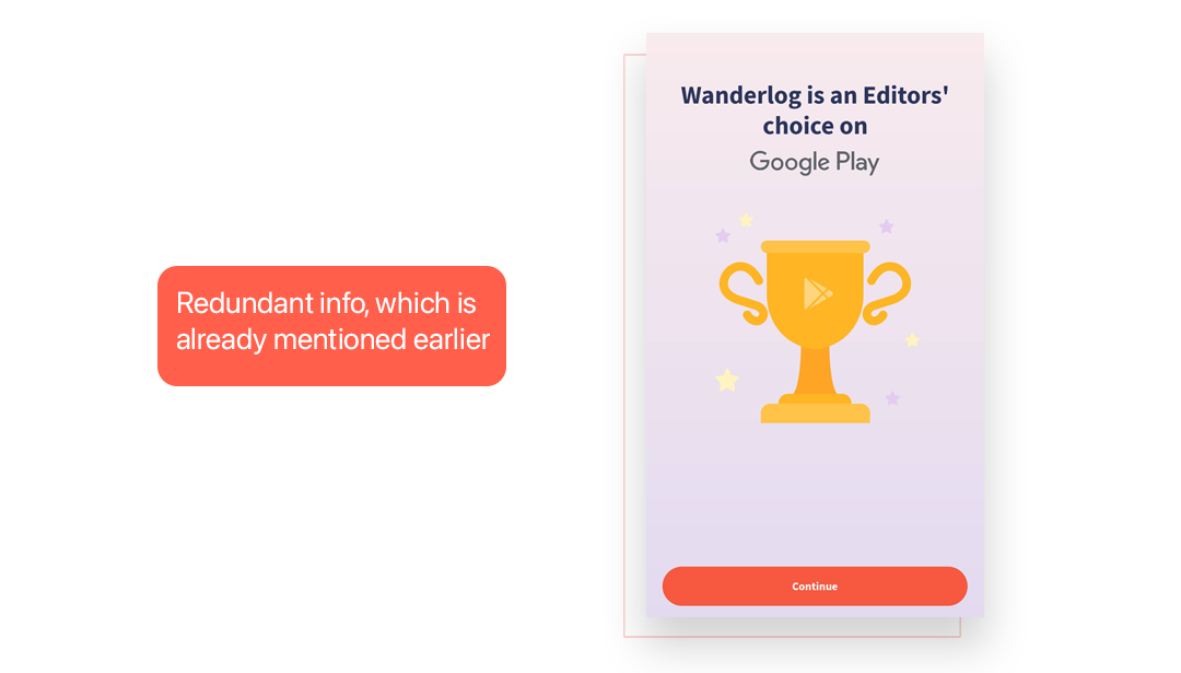
The same Editors' Choice badge — shown again. Already mentioned in the ad. Already shown on the entry screen.
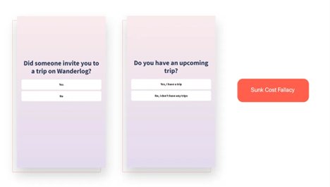
Two questions that anchor me in the flow before I've committed to the app.
I lost patience as well as interest… But I invested my time and used my Gmail to sign up.
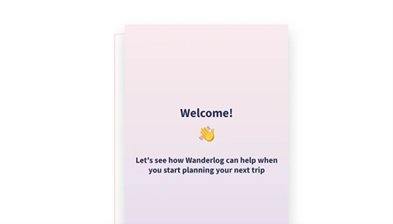
A welcoming screen — finally. But we're only at the beginning of a very long journey.
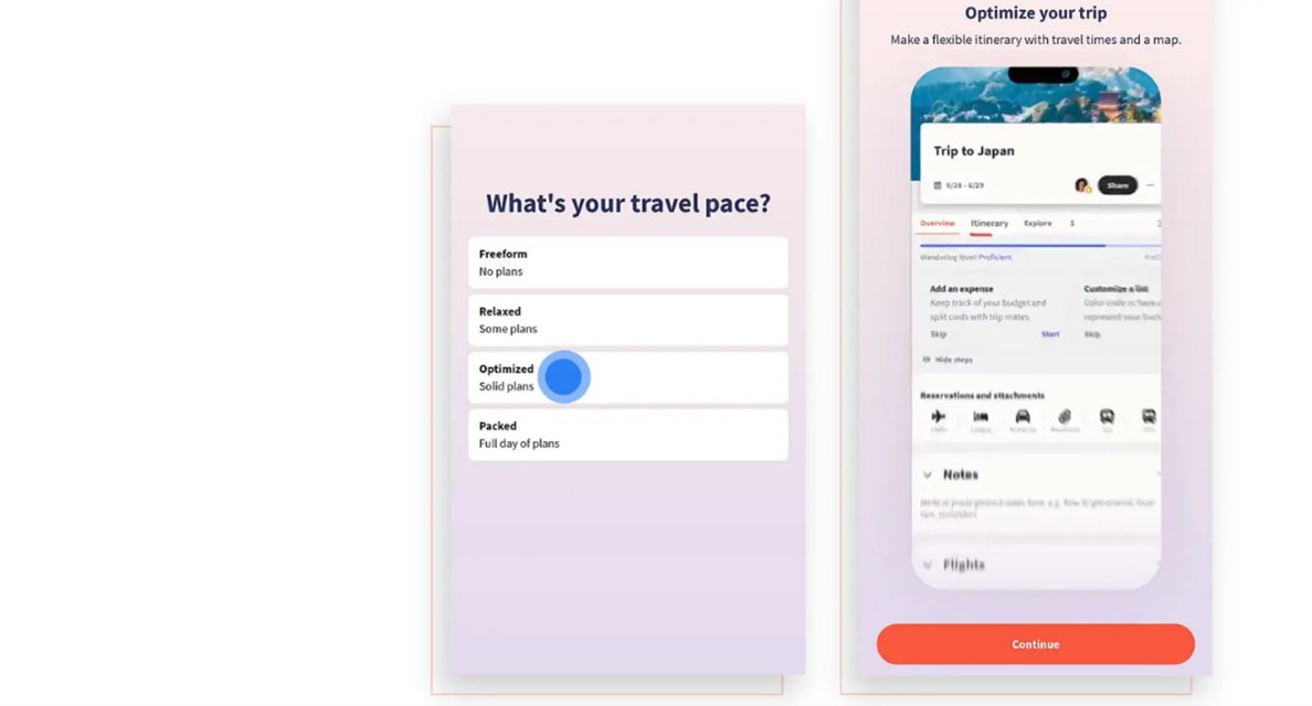
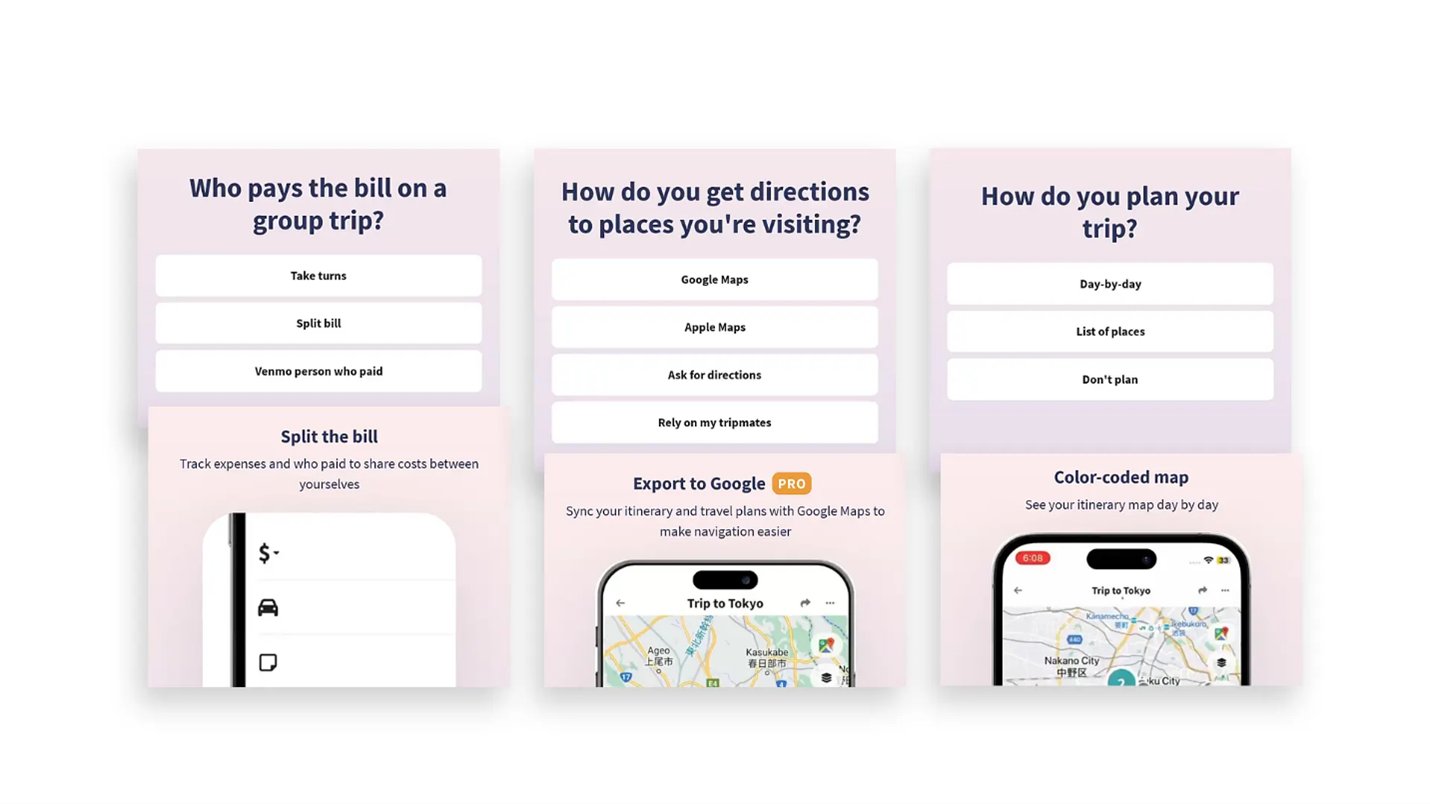
"What's your travel pace?" — the first of many questions. Paired with a looping feature video.
I tried to keep my mind clear and started giving answers.
Okay. Let me see what they meant by the "optimized trip plan" option (video on loop).
Another question, another looping video showcasing a Pro feature.
The pattern is clear: ask a question, show a feature. It's not personalization — it's a feature showcase.
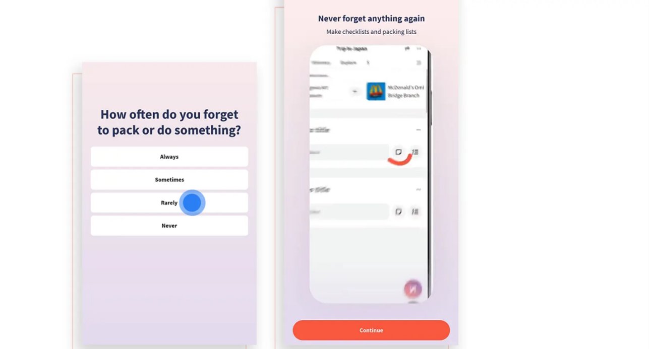
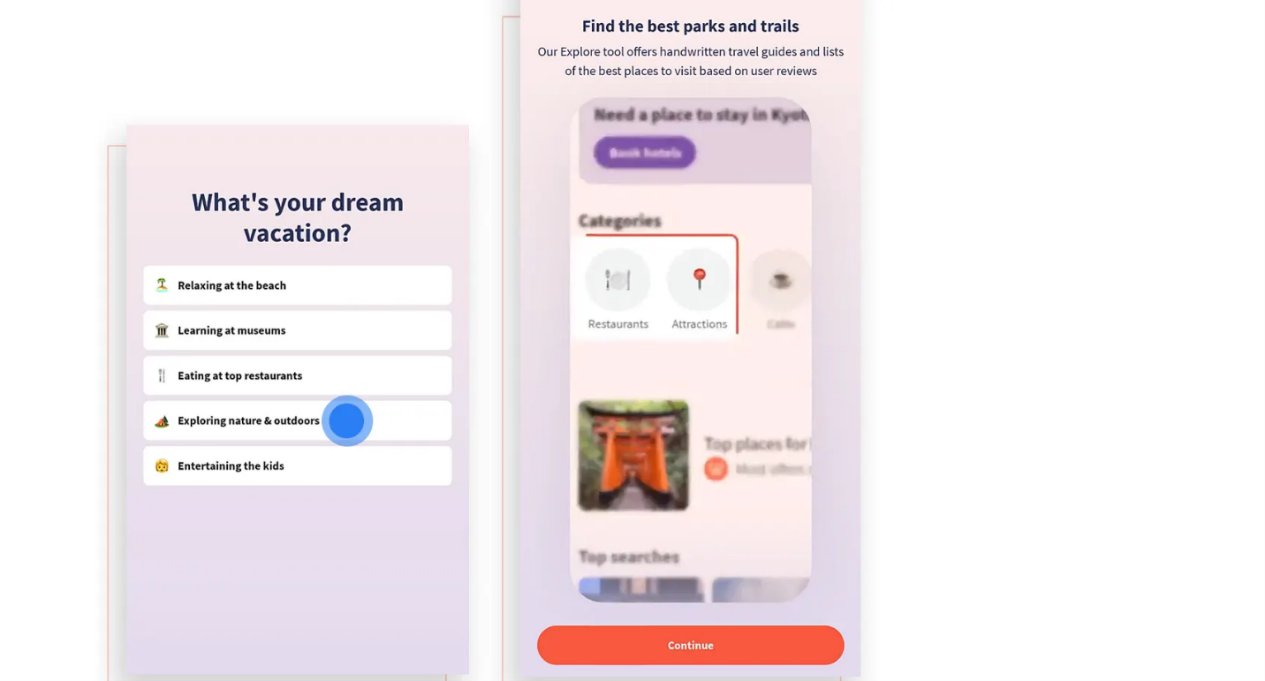
Question after question — each followed by a product feature video. The cognitive load keeps building.
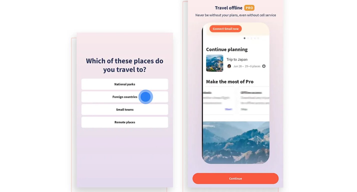
Destination type question + Travel offline upsell
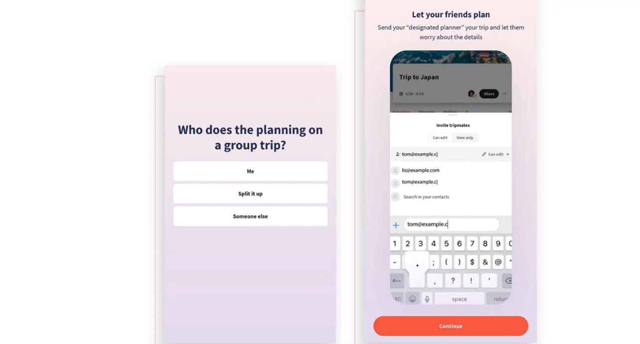
Group planning question + invite tripmates feature
They didn't ask me whether I was planning a solo trip, a trip with friends, or a family trip. Imagine I'm a solo traveler?
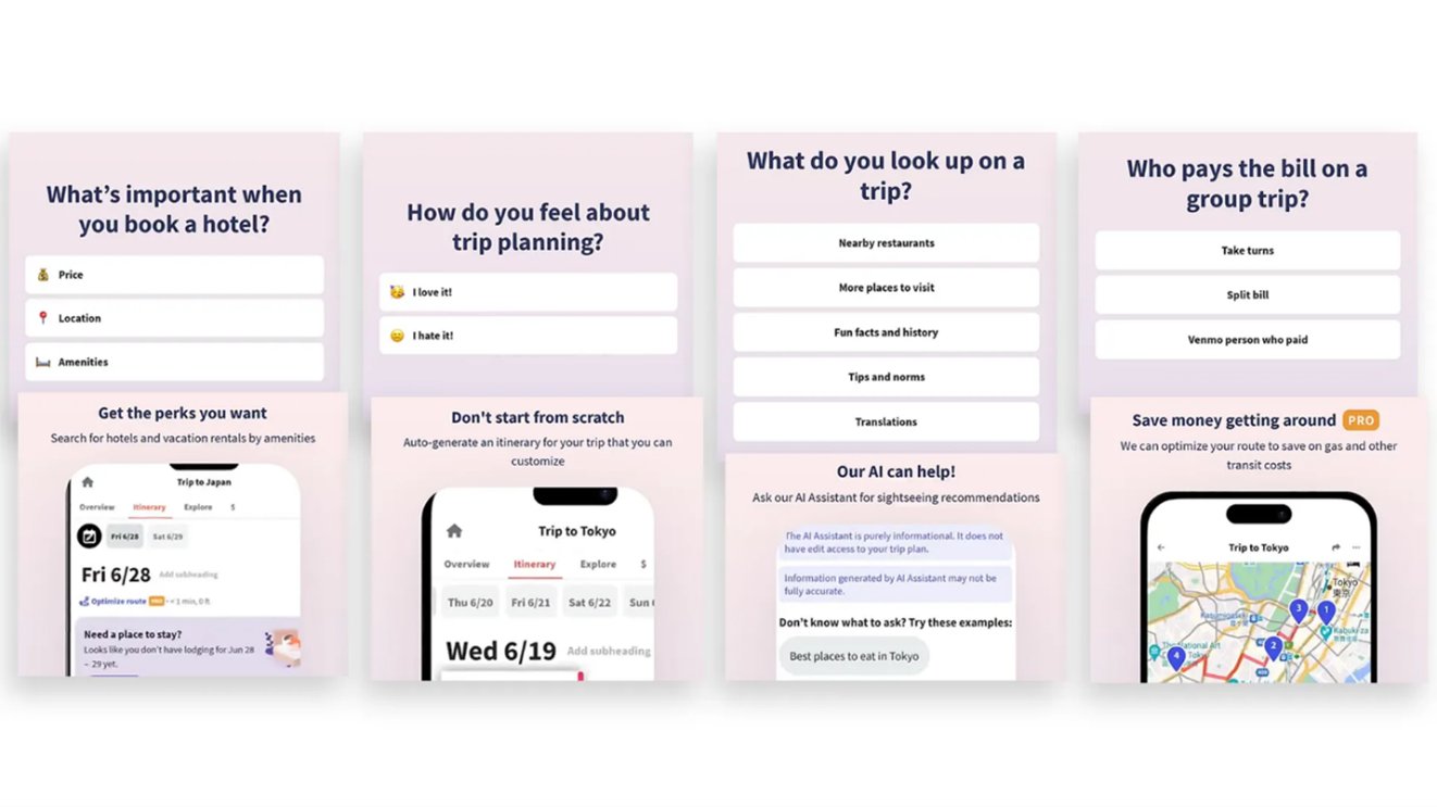
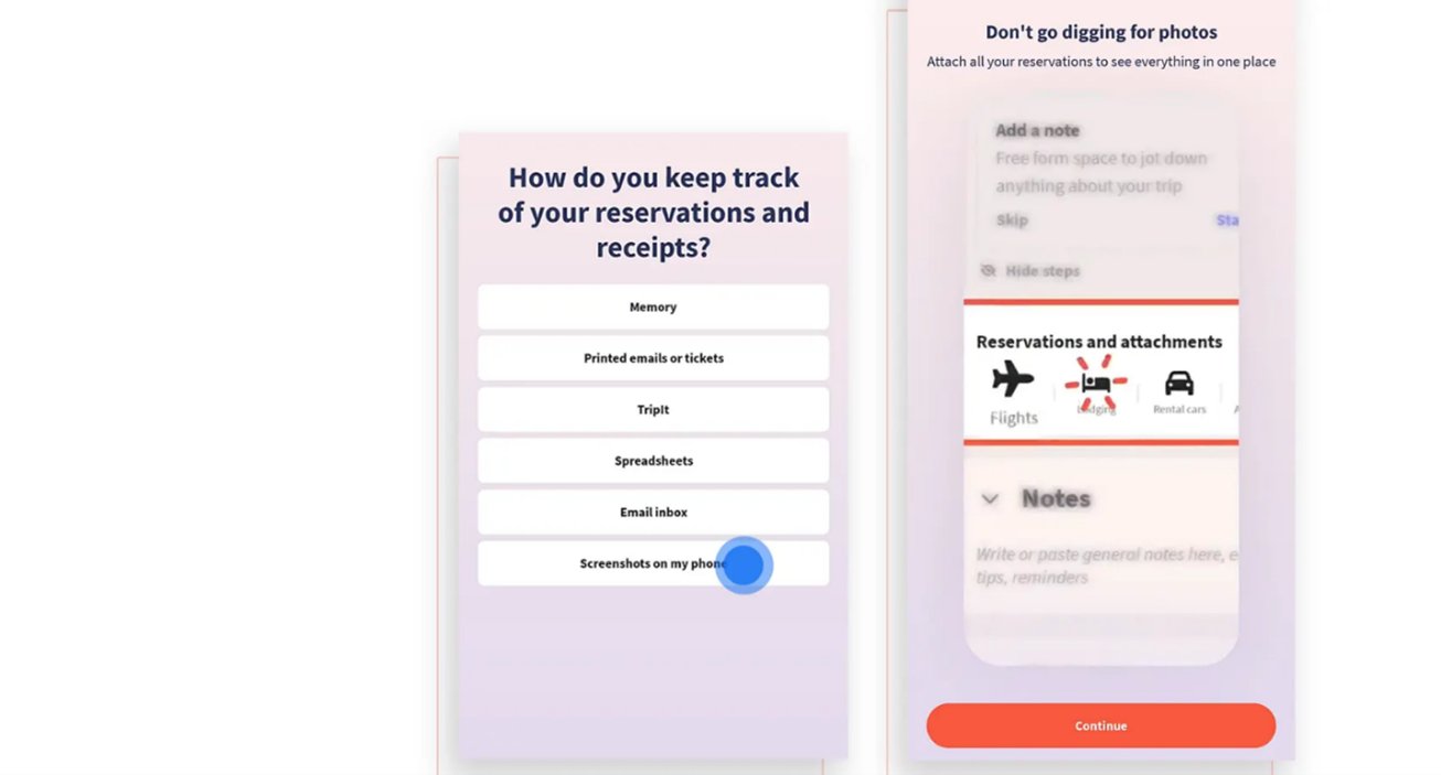
Four more questions — hotel booking, trip planning feelings, what to look up, group bill splitting.
Still asking. Still going. No progress indicator. No end in sight.
Finally finished their version of "customization"
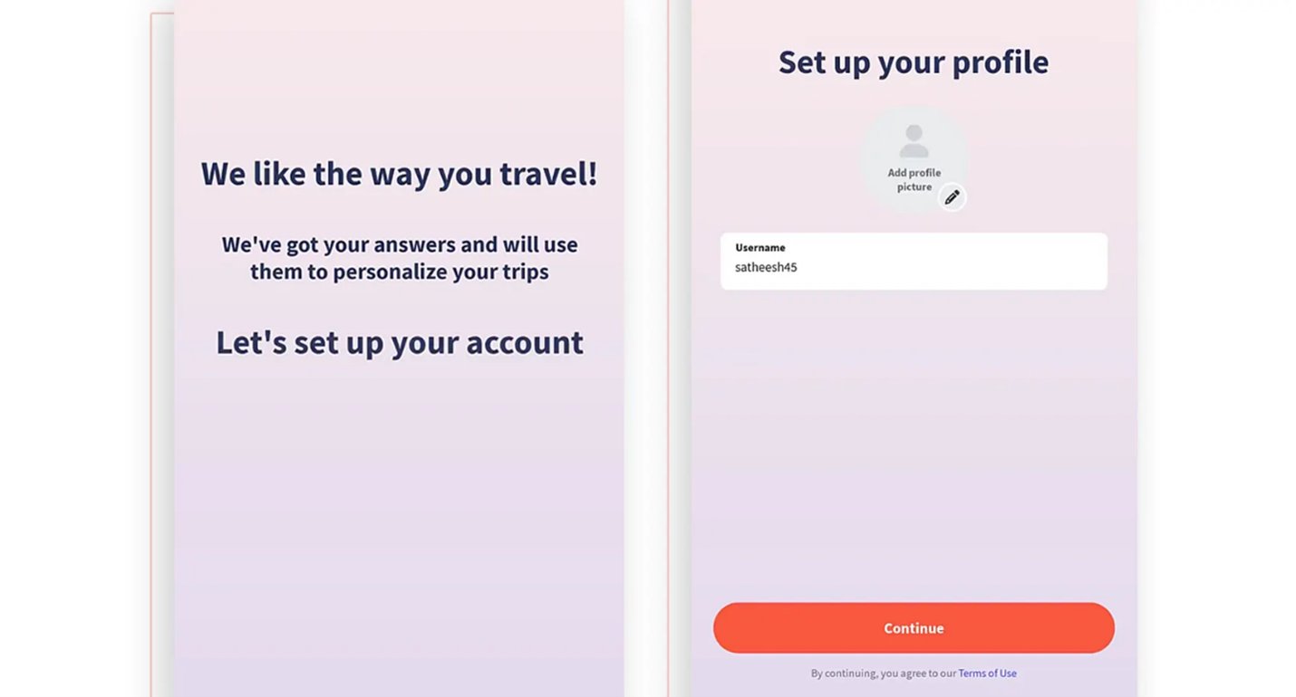
"We've got your answers and will use them to personalize your trips." Then: set up your username.
After all these questions, they tried to upsell me before I even used the app, across three pages with a barely visible close button.
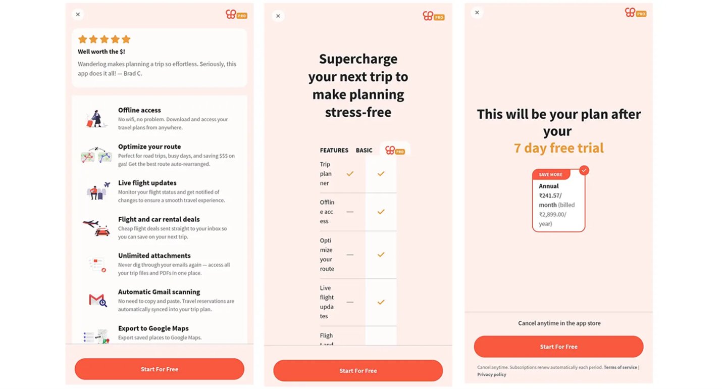
Three consecutive upsell screens. The close button is barely visible. I haven't used the app yet.
Where is the customized version they tailored for me?
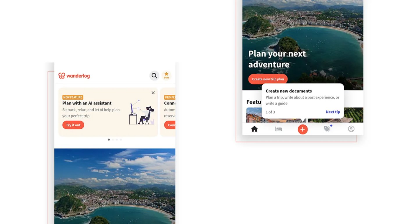
After all of that — a generic dashboard. The same one everyone gets. No personalization visible.
Wow! 38 screens, including 13 looping videos, and I finally reached a general/random dashboard.
Let's redesign to make the onboarding smoother
The same goals. Fewer screens. More clarity. Real personalization.
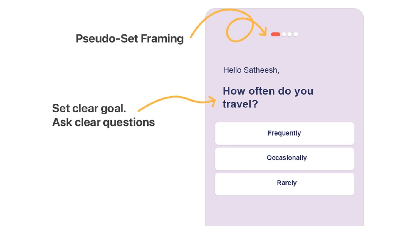
Pseudo-set framing done right: a visible progress indicator + a clear, purposeful question.
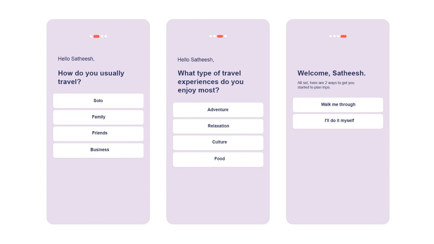
The redesigned flow: 3 meaningful questions → personalized welcome → user chooses their path. Done.